Design Framework
Grids also facilitate responsive design, which is crucial in today’s multi-device world. A well-structured grid allows for content to be easily reflowed and resized across different screen sizes and resolutions. This ensures that your design remains visually coherent, whether it's viewed on a large desktop monitor or a small mobile screen. By using a flexible grid system, you can create layouts that adapt seamlessly to different contexts, enhancing the accessibility and usability of your design.
Structured Design
Using a grid system also enhances the collaborative process in design. When multiple designers are working on the same project, a grid provides a shared reference point that ensures consistency across different sections or pages. This is especially important in large-scale projects, such as websites or publications, where maintaining a unified visual language is key to the overall user experience.
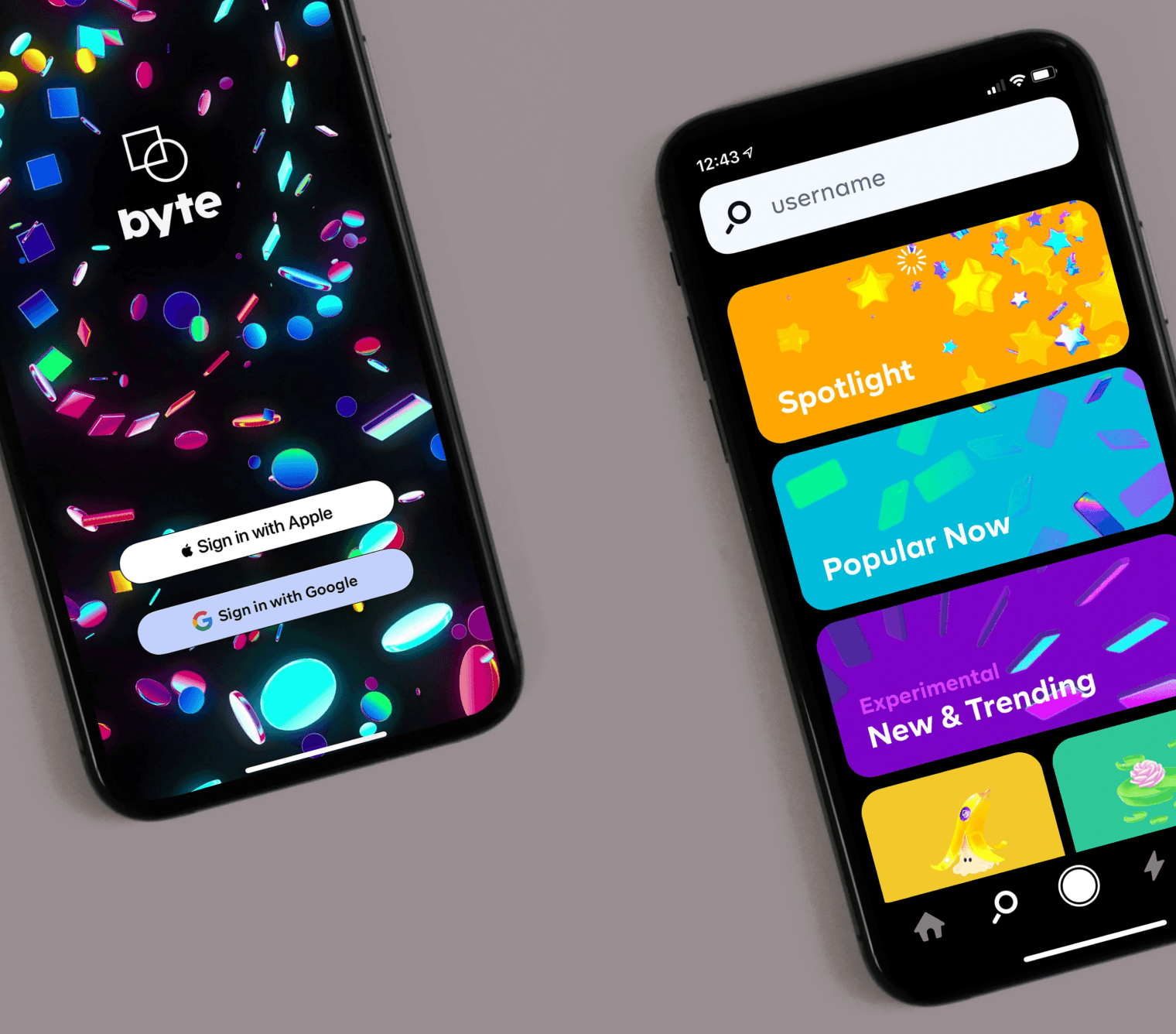
However, while grids are a powerful tool, they should not be seen as a constraint. The best designs often play with the grid, breaking the rules in strategic ways to create interest and draw attention. Knowing when and how to deviate from the grid can add dynamism and personality to your design, making it more engaging without sacrificing structure or clarity. There are various types of grid systems that designers can use, each with its own advantages. The most common is the column grid, which divides the layout into vertical sections. This type of grid is ideal for organizing text-heavy content, as it allows for clean and readable columns of text. Modular grids, which divide the layout into both rows and columns, offer more flexibility and are often used in more complex designs, such as magazine layouts or web interfaces. Baseline grids, which align text to a consistent vertical rhythm, are particularly useful in typography-focused designs, ensuring that lines of text are evenly spaced and aligned.
In conclusion, grid systems are essential for structuring layouts that are both visually harmonious and functionally effective. They provide a framework that helps organize content, establish a clear hierarchy, and maintain consistency across different media. By mastering the use of grids, designers can create layouts that are not only aesthetically pleasing but also enhance the overall user experience, ensuring that every element works together in perfect harmony.