Typography & Branding
Font Size and Weight play a significant role in creating a visual hierarchy and guiding the reader's attention. Headlines and subheadings typically use larger or bolder fonts to stand out and draw attention, while body text is set in smaller sizes for readability. Font weight, ranging from light to bold, can also be used to emphasize important information and create contrast. Properly managing font size and weight ensures that text is both readable and visually balanced.
Readability & Legibility
Alignment and Justification influence how text is presented on a page or screen. Left-aligned text is often preferred for body copy as it creates a natural and easy-to-follow flow. Centered text is used for emphasis or decorative purposes, while right-aligned or justified text can add a sense of formality or structure. The choice of alignment should complement the overall design and ensure that the text is easy to read and visually appealing.
Hierarchy in typography helps organize content and guide the reader through different levels of information. By using variations in type size, weight, and style, designers can create a clear visual hierarchy that prioritizes key information and makes the content more navigable. Effective hierarchy ensures that important elements, such as headings and key points, stand out while maintaining a cohesive and organized layout.
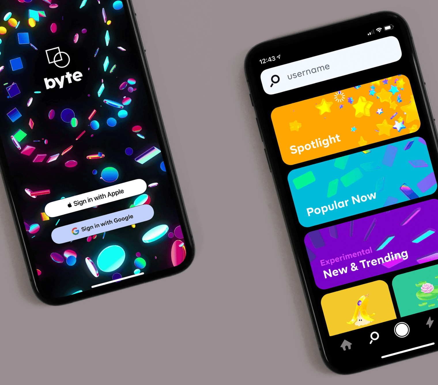
Typography and Branding are closely intertwined, as typefaces contribute significantly to a brand’s identity and personality. Consistent use of specific typefaces and typographic styles helps reinforce brand recognition and convey a brand’s values and tone. A well-chosen typeface can become synonymous with a brand, creating a memorable and recognizable visual signature.
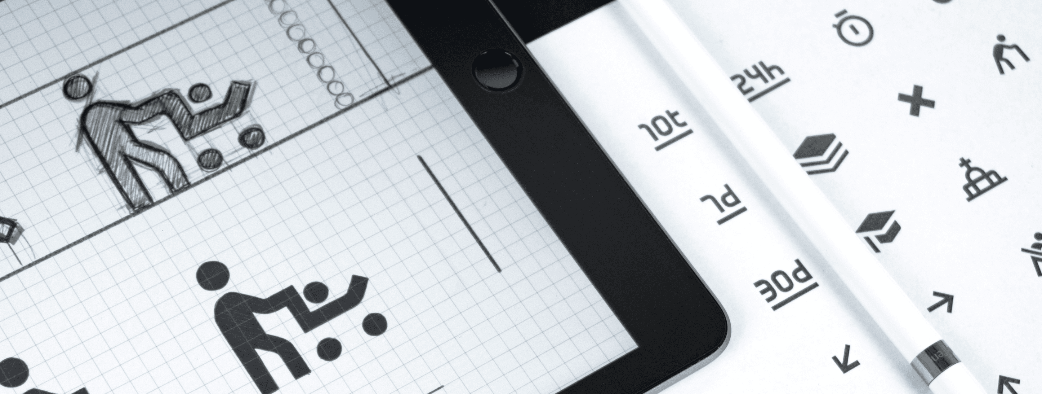
The Craft of Typography is about more than just choosing attractive fonts; it’s about using type as a design element to enhance communication and create a cohesive visual experience. By understanding the principles of typography and applying them thoughtfully, designers can express ideas with elegance, clarity, and impact. Typography has the power to transform text into a visual art form, making it an essential aspect of effective design and communication.